sticky fingers ribhouse
bringing a new vibe to an old classic
When it comes to keeping up with the times, it's hard to also keep close to the ones who brought us here. With Sticky Fingers, we saw it less as a re-branding and more of a reimaging to keep what worked and bring in some brand new awesome.
COMPANY OVERVIEW
Sticky Fingers Ribhouse was founded in 1992 in South Carolina and had kept their original brand since them. They’ve since expanded from their sole Mt. Pleasant location to 3 additional ones all over the state.
Project timeline
August 2021 – January 2022.
There was an amount of initial setup to this project including competitor and consumer research. Design work included developing a new logo, brand guides, and mockups for clients to reference.
my part to play
Along with assisting in concepting, design, and development of their brand, I also had a strong role to play in helping them understand certain design choices and embracing new and different ideas.
software
Adobe Illustrator
Adobe Photoshop
Figma
summary
The team at Sticky Fingers came to us with a very interesting problem. As they had not changed their look or feel since they were established in 1992, they realized that they were falling out of possible new business with younger audiences. So along with having other teams work on revitalizing their interiors, website, and bottles, we were tasked with the largest problem of them all – their brand. It was hard to gauge how much they wanted to change, but they knew they needed to change something to appeal to a wider audience of young folks that they hadn’t been able to in prior years. They also looked for guidance on how to present themselves on places like Facebook and Instagram to keep their look consistant.
Concepts
ideation & design
Early moodboards & concepts were a huge stratification of ideas. From a hot pink almost punk vibe with neon lights and exposed brick, to a more industrial blue and blocky vibe, we played out all the options. We ended up in a good place with the yellow tones of some of the ideas, but they never seemed settled on a new logotype that fit them whil keeping it new.
Final Brand
design & development
After much direction and back and forth, we ended up actually cleaning up their old logo. We smoothed out some of the rough paint-like edges and gave it a brand new coat of paint, including adding “Ribhouse” to the actual logo. The client LOVED it as did testing audiences.
Branded mockups
concept & design
Along with giving the client a little nudge in the right direction visually, we gave them a number of assets for them to reference when making ads, orgo social, and merch. Needless to say, they’ve kept it up and were thrilled with the look and feel!
conclusion
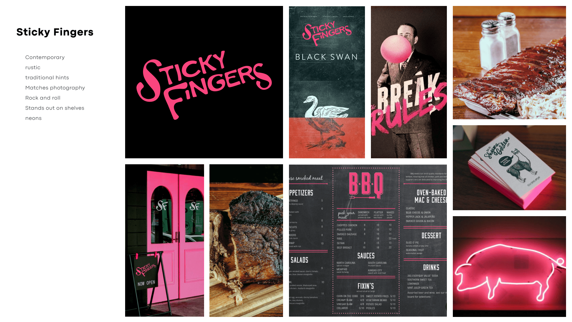
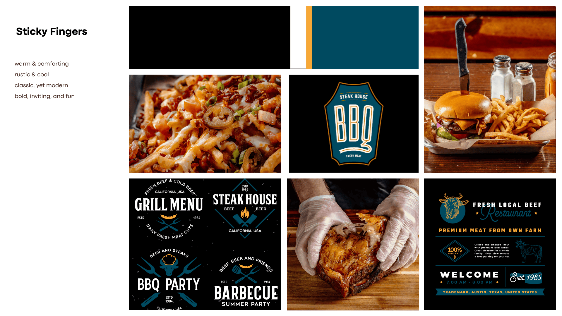
Working with such an established and beloved brand was rewarding, but came with its own host of challenges. Many times during the development and consumer research, the boat was rocking and it wasn’t always the easiest to get us back to steady seas. Thankfully, calmer heads prevailed and we ended up in a great place.
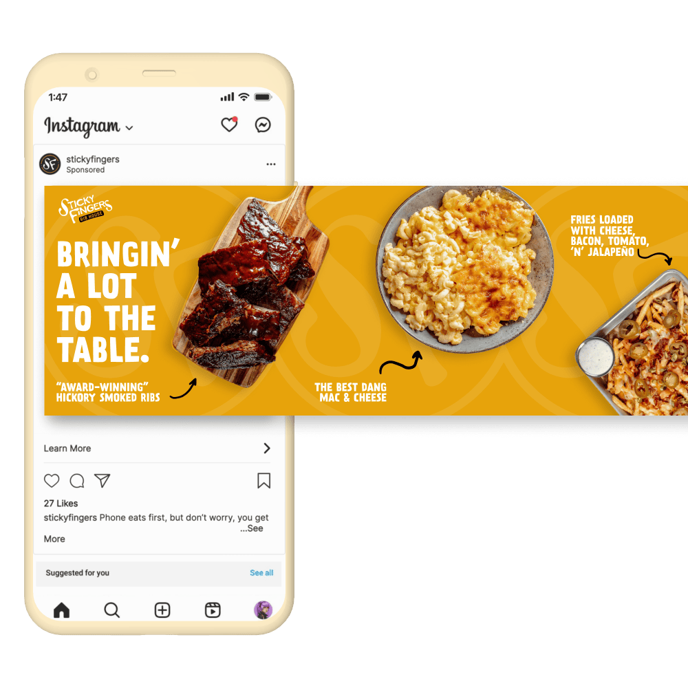
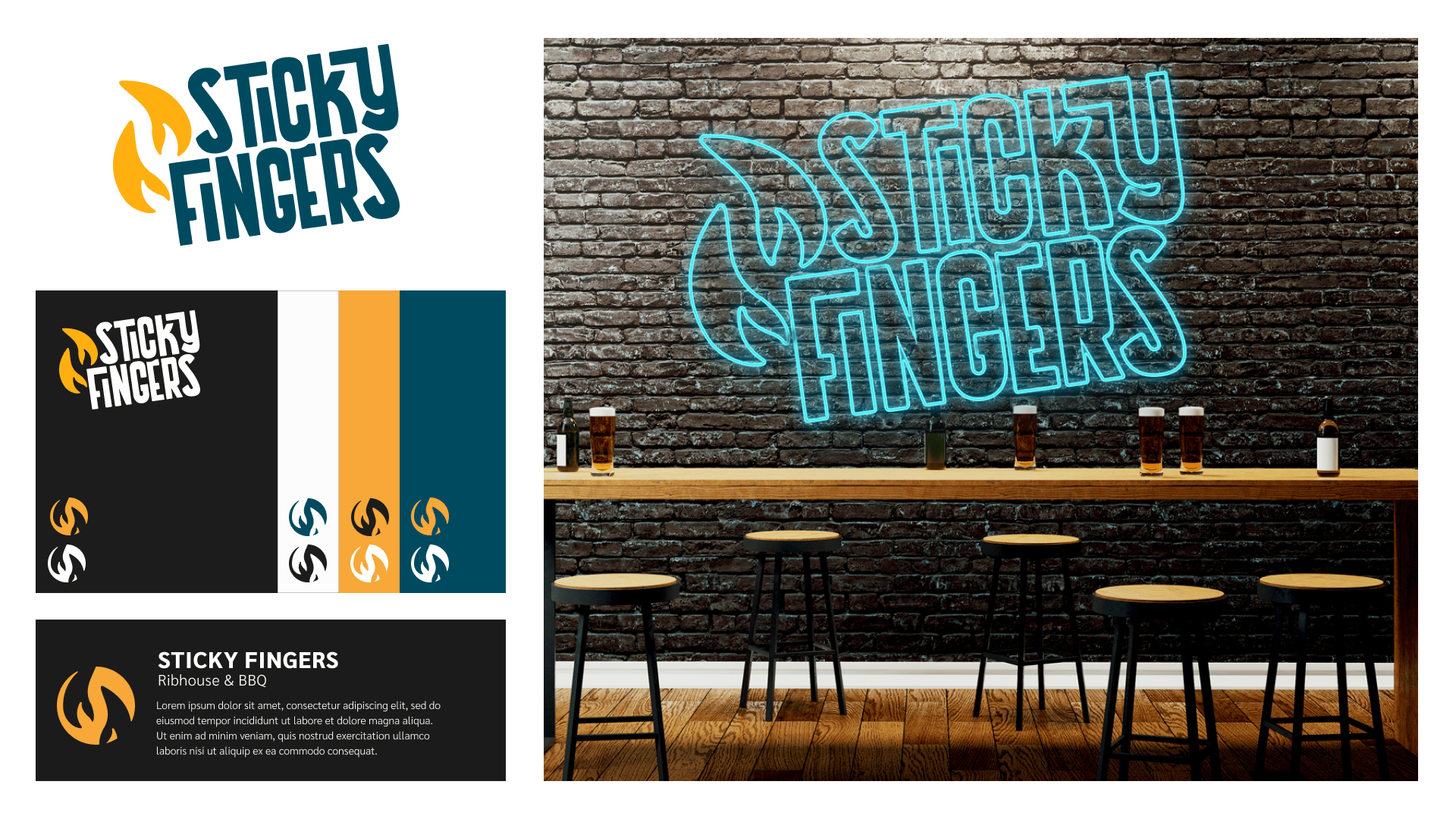
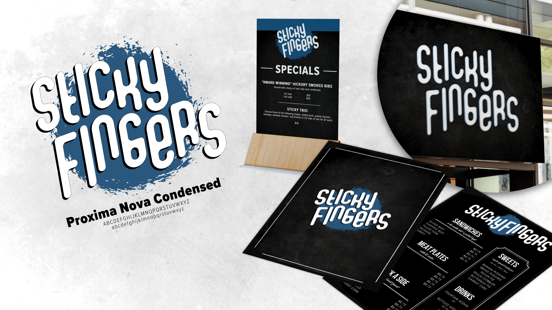
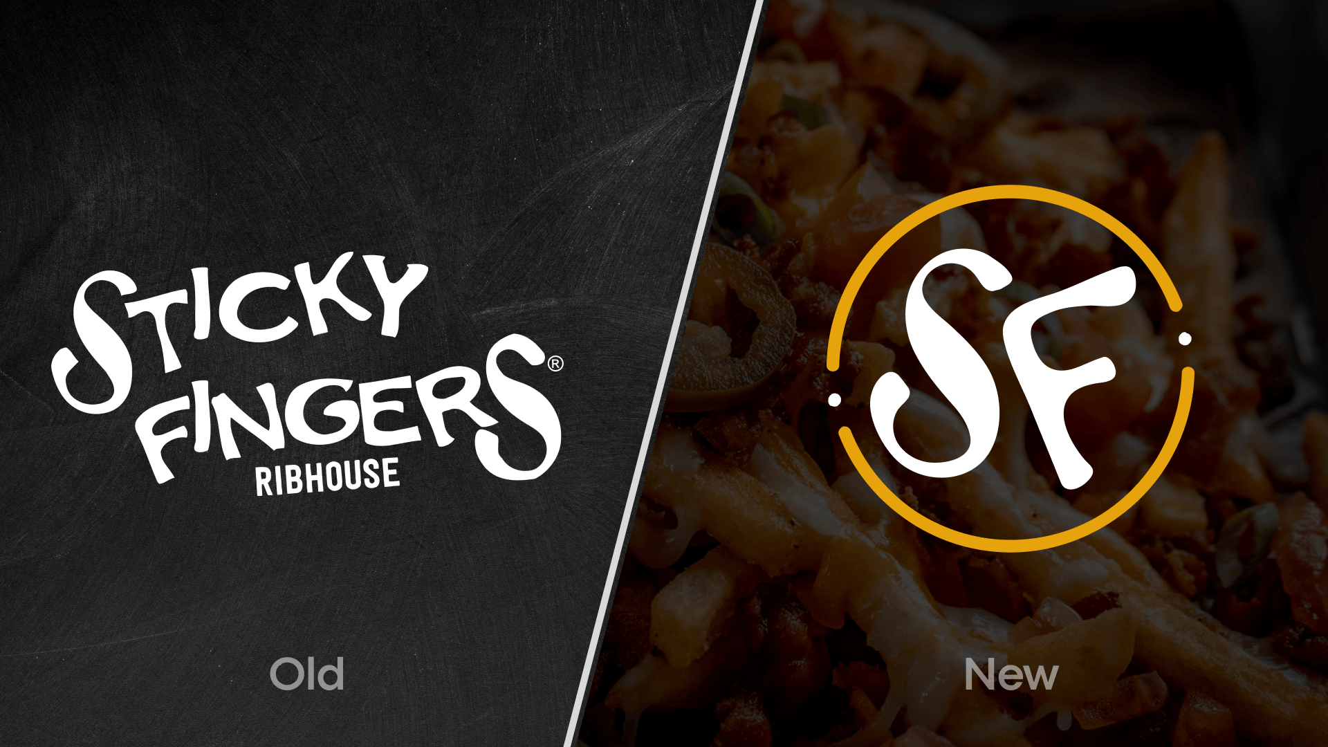
It wasn’t necessarily a ground-up reinvention of the brand, but it was cleaned up, given a new and more food-friendly color, and it ended up serving the best of all the worlds they were looking for. Sticky Fingers still uses this brand as of 2024 and uses our brand guides as touchstones for how to show themselves in their online presences and in stores. We couldn’t be more happy with the results and the client was more than trilled with their returning customers loving the change and the new customers coming in for the first time.